Prepared By: Nur Syakirah Jasni (Executive Officer 4)
Office of the Deputy Dean (Development and Networking)
Universiti Putra Malaysia

At every research conference or symposium, posters serve as the primary medium for communicating research findings to the audience. However, a trend often observed among researchers is the tendency to produce what I term an "Illustrated Essay." This occurs when limited poster space is crammed with overly dense text, thereby neglecting the poster's original function as a medium of visual communication.
Cognitive Load and Human Nature
Scientifically, the human brain processes visual information much faster than text. According to a study by the Massachusetts Institute of Technology (MIT), the human brain can identify images seen in as little as 13 milliseconds. In the context of information delivery, visuals are processed nearly 60,000 times faster than text (Vogel et al., 1986).
When we present excessively long text on a poster, we are actually forcing the audience to undergo a high Cognitive Load process. According to the theory by John Sweller (1988), readers tend to lose focus if the information to be processed exceeds the capacity of their short-term memory. Consequently, the essence of a great study might fail to be communicated simply due to a weak visual presentation.
The Poster: A Gateway, Not a Full Report
We need to understand that a research poster functions much like a billboard, not a thesis or a journal. The primary role of a poster is to capture the audience's interest within the first 3 to 5 seconds so that they stop and want to find out more.
Among the common mistakes frequently made include:
- Directly Copying the Abstract: Inserting the entire abstract text without any emphasis on key terms.
- Absence of Visual Hierarchy: Presenting information without differentiating the sizes of headings, sub-headings, and body text, making it difficult for the reader's eyes to find a focal point.
- Low Image Quality: Using low-resolution (pixelated) images or graphs that undermine the researcher's professional credibility.
Transforming Data into Infographics
An effective infographic does not mean compromising data integrity; rather, it is a technique of simplifying complex data into a more efficient form.
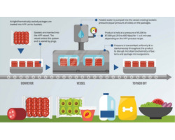
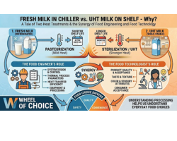
- Use Visuals That Tell a Story: Humans remember 80% of what they see compared to only 20% of what they read (Lester, 2006). Utilizing icons or simple illustrations to replace long sentences can accelerate audience comprehension.
- The QR Code Strategy: To maintain a clean poster layout, detailed information such as references or full methodologies can be placed inside a QR code. This allows the poster space to be fully utilized for maximum visual impact.
The Menu and Recipe Analogy
As members of the Faculty of Food Science and Technology (FSTM), we can view this poster as a menu board. In a menu, we only display attractive visuals of the dish and its key ingredients. Detailed cooking procedures or specific oven temperatures (which can be likened to a journal) should not be displayed there. Let your poster be an "invitation" for further discussion, rather than an exhausting reading session.
Conclusion
The greatness of scientific research lies not only in the accuracy of its data but also in the effectiveness of how that data is communicated. Shifting from an "Illustrated Essay" to a clean infographic not only reflects our professionalism but also respects our audience's time and attention.
Hopefully, moving forward, the posters produced at our faculty will not only be rich in knowledge but will also stand proud with high visual quality.
Fact References:
- Potter, B. et al. (2014). "13 Milliseconds: The Speed of Sight." MIT.
- Vogel, D. R., et al. (1986). "Persuasion and the Role of Visual Presentation Support." University of Minnesota.
- Sweller, J. (1988). "Cognitive Load During Problem Solving." Cognitive Science.
- Lester, P. M. (2006). "Visual Communication: Images with Messages."
Date of Input: 08/06/2026 | Updated: 08/06/2026 | nur_jasni
MEDIA SHARING


.jpg)